Sunday, 26 April 2020
WEEK 10: 10 BEST IMAGES
THE STORY OF 'HIRAETH'

WK8: PHOTOSHOP MODEL

WK 8: MODEL 6 NEW MATERIAL

WK 8: FUSION 360 MATERIAL RENDERING

WK 7: ITERATIVE MODEL 4

WK 7: ITERATIVE MODEL 3

WK 7: ITERATIVE MODEL 2

WK 6: MEASUREMENTS, DIAGRAMS AND SKETCHES

WK 7: LASER CUT MODEL OF TRANSITION SPACE

WK 5: MODEL 1 OF SPACE - (1:40) SCALE

WK 5: MEASUREMENTS, DIAGRAMS AND SKETCHES
WEEK 9: 100 Word statement
Hiraeth
Hiraeth explores ones earnest longing for comfort within a rapidly advancing society. My models capture this desire, materialising it into a simple homely structure that slowly becomes corrupted by modern progression, fluctuating between complicated designs and minimal forms. This is seen in the neat rectangular construction of my first and third models, wide, symmetrical cut outs softly filtering light in to saturate the room in warmth. Yet this warmth is juxtaposed by the harsh geometric structure of my second and sixth models, triangular bodies manipulating light to create overlapping shadows reflecting the multifaceted harshness of modern society. By oscillating between these two themes, I have successfully used light to communicate a complex journey through ones emotions and visualise social progression.
WEEK 8: Photoshopped models
Using Adobe Photoshop 2020 to complete this task, the environment each model was placed in was decided by comparing its materials to the suitability of it within that environment. To ensure that the model blended seamlessly with its surroundings, perspective adjustments and changing the tone and hue was a necessary task. Without doing so, the lighting and appearance of each model would have been inaccurate. This was the hardest part of the task however the most rewarding as it showcased the model to its full potential.


PHOTOSHOP 1
Using model number 3


MATERIALS: White brick, Grey textured concrete, Maple wood tiles
The materials chosen were based on their aesthetic co-ordination to create a light and white colour scheme. These white brick and textured concrete provide an interesting juxtaposition to each other and are strong enough to support the structure and design of the house. The delicate maple wood tiles contrasts the exterior and brings the materials together in a harmonious manner.


PHOTOSHOP 2
Using model number 4


MATERIALS: White textured concrete, Dark grey steel, Hickery wood tiles
In order to maintain the attention at the abstract design of the house, the material choices remained simple and clean, choosing to effectively highlight certain aspects of the model. The concrete wall ensures support to the frame of the building whilst the hickery wood juxtaposes the materiality of the concrete to create a warm welcoming front. The steel highlights and supports the main entrance of the model to cohesively bring the model together.
PHOTOSHOP 3
Using model number 6


MATERIALS: Cherry wood, Black marble, Sandstone coated tiles
To create a modern twist to the 'cabin in the woods' style, black marble was added to the exterior roof of the first floor to enhance the black colour of the model, whilst the cherry wood works to juxtapose the modern texture with a classic design. The sandstone coated floor works to not draw attention away from the exterior, but to remain subtle so the exterior remains prominent.
WEEK 8: Iterative model with different material
Measurements & Plan for construction
By creating a secondary half-floor to the bedroom, lighting is able to caught and manipulated from the back of the model and combined with the various open cut outs at its front to further illuminate the room. This builds upon the desire to create intricate shadows with manipulated light that forms an unconventional yet aesthetic structure. By adding the second layer to the structure, the asymmetric form builds upon the triangular geometry in previous models, and combines it with vertical cut outs to create a new design.

Aspects taken from other models
- rectangular box form from model 1 & 3 as it is the most structural form
- The triangular geometry from model 2 but manipulated to fit the structure
- The use of parallel lines and pillars from model 4 as they are effective in catching light
MODEL 6
 Frontal perspective
 Eastern perspective with additional light
 Southern perspective
 Western perspective
 Interior perspective


EXPERIENCE
- Working with black cardboard made it stronger in structure despite being thin, however was quite difficult to cut clean lines with an exacto blade due to its slight rough texture. It was determined after trial and error using scissors was more appropriate
- Through creating a secondary floor, it was gave height and dimension to the design that was able to catch light effectively.
WEEK 8: Fusion 360 Model material rendering
360 View of the rendered model
FINAL DESIGN


The choice of materials in this model was mainly decided on the materials ability to form a cohesive monochromatic aesthetic, and the ability of the materials to work and complement light. Texture was also an important deciding factor as different textures would not form a cohesive aesthetic.

Materials in design (from left to right)
- Coating - Black Oxide: Chosen due to its sleek texture and ability to work with any material
- Oak wood: Chosen due to its textural juxtaposition to the other materials which gives the model dimension that contrasts the exterior.
- Bronze- Patina: Catches light well and its warm tone complements the oak wood whilst not drawing attention away from the monochromatic colour scheme
- Chrome - Black: Shiny. Reflects light and makes a big impact on the exterior aesthetic of the model.
- Jade (white): Contrasts the other dark materials to make the model look clean, inviting and neat.
Lighting
- Cool light was chosen due its ability to give a silvery reflection to the chrome materials that complements the exterior jade coating. This light also juxtaposed the materiality of the interior which thus draws out the interior aesthetic even more.
LIGHTING EXPERIMENTATION


Crossroads lighting
(+) warm and delicate exterior
(-) Not the desired effect


Warm lighting
(+) Complements the interior warm textures
(-) Warmth draws away the silver/chrome exterior light
WEEK 7: Laser cut module of transitional space
Measurements & plan for construction
By changing the material to black cardboard that is stiffer and stronger than white cardboard paper, the material is the closest to mimic the use of plywood if actually cut. Black cardboard also makes the cutouts more evident and easier to see. Glue was also used as extra support to the tabs


Due to the use of black cardboard, some tabs have been outlined in white to be easier to see
MODEL 5: LASER CUT MODEL

Front perspective without roof

Front parallel perspective

Top view without roof

Top view with roof
EXPERIENCE
- (+) Black cardboard is thicker than the material i had been working before and was stronger and more dimensionally stable. It was the best i could find to replicate wood.
- (+) Easy to cut with and form the shapes and was not easily damaged
- (-) The material was too thin to replicate wood and as a result the tabs were too thin to hold the box in place so glue was used to aid. The tabs are hard to see as well as a result of the thin nature of the tabs.
- (-) Despite the black material looking sleek and clean, it is difficult to see the details of the forms, specifically the tabs. It was also easy to see mistakes and the glue used to help.
However despite the issues faced, the model was to scale and accurately depicted the spaces similar to the Fusion 360 models. It was able to communicate the openings, spaces and transition hallway.
WEEK 7: Fusion360 3D shapes
FAILED ATTEMPT
The initial attempt to create my initials 'STP' (Shutima, Tangmo and Pompanya) faced extreme difficulty during the modelling of the S face and had to be attempted multiple times by trial and error before a successful S was created. This was due to the thin and curvaceous form of the letter and thus causing it difficulty during the lofting process

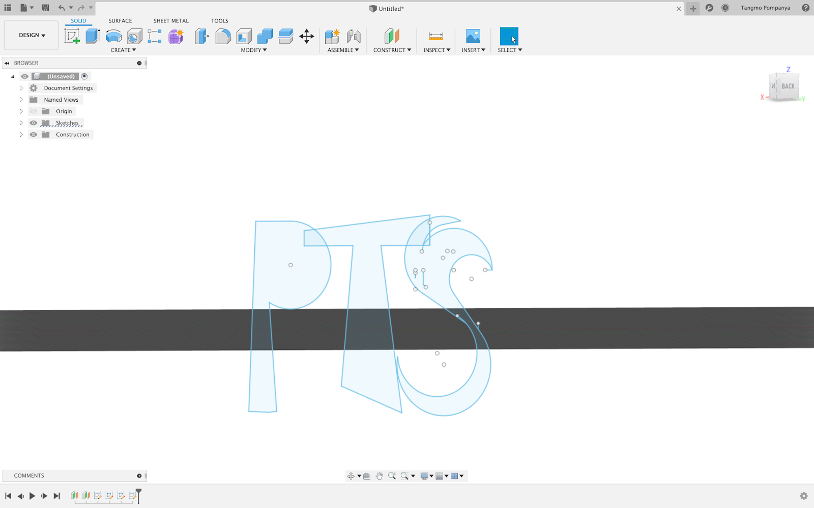
After much difficulty, the letters were able to be lofted, however despite the amount of adjustments to each face, it was unable to be extruded and thus i moved on with an attempt to create the 3D shape using the letters 'TOP'.

SUCCESSFUL ATTEMPT
After learning from my mistakes in the first attempt, I made the letters much bigger and less rectangular in order to easily create a loft and extrude. This worked efficiently after some experimentation, however the shape of the O cannot really be seen in the exterior form.


EXPERIENCE
- Was able to learn new features such as lofting and extruding
- Learnt how to create shapes on various planes and manipulate these faces
Saturday, 25 April 2020
WEEK 7: 3 Iterative Models with an additional source of natural light
MODEL 2: Additional source of light by manipulating the roof structure
In order to manipulate natural light in a way that penetrates the model efficiently, the roof of the original model has been manipulated and folded geometrically to allow light in from various angles. The triangular cut outs allow light directly into the model alongside the window opening. By forming asymmetric triangular forms, the roof maintains its structural integrity whilst also juxtaposing the rectangular form of the room. This design allows natural sunlight despite the position of the sun in the sky and does not alter the dimensions of the room, but rather adds height to the ceiling.

Adjustments from MODEL 1
- The scale has been adjusted from 1:40 to 1:20 to experiment with the structural integrity of the model and finalise a reasonable scale for the final models.
- Raised roof and added geometric structures to the roof
- Triangular cut outs allow light to penetrate the model from various angles
- West wall has been cut out to make the model as a section and thus see the interior.
MODEL 2

Frontal perspective
From this perspective and light directly above the model it becomes evident through the triangular shadows the way light directly penetrates the model and creates forms that juxtapose the rectangular openings of the window.

North-West Perspective

Interior perspective
By viewing the model from this perspective, the uneven height of the ceiling and its cut outs are able to be visualised and make evident the designs ability to manipulate light.

North-East perspective
Experiences
- By working with the same material (cardboard paper) at a 1:20 scale, it has become evident that the paper loses a percentage of its structural integrity (seen by the bent northern wall) and thus does not structurally support the rest of the model. Therefore for the next model, a scale of 1:30 will be implemented as a median.
- By using tracing paper to mimic the glass to cover the window, the model was unable to let through any light efficiently. Therefore tracing paper will be used as an interior material for the model due to its aesthetic qualities.
- Whilst initially desiring to create the geometric roof forms by scoring the paper, this plan had to be adjusted accordingly due to the inability of the material to support itself and glue was used to join certain parts of the ceiling. This makes evident the weakness of the paper and thus glue will be used if needed going forward.
- The triangular cut outs combined with the horziontal windows may be too intricate and distracting to the overall purpose of letting light through as it becomes too much for the eye.
MODEL 3: Additional source of light by manipulating wall and roof structure
By manipulating the east and west walls along with the roof, light is able to be channeled and directed into the model of the room. By opening the walls up, there are more opportunities for light to penetrate the model and thus ensure the room receives light independent of which way it is facing or how it is moved. The asymmetrical cut outs on the east and western walls pay tribute to the asymmetry in the second model, however its rectangular form morphs to the original structure of the room and thus creates a more aesthetic and cohesive model.

Adjustments from MODEL 2
- Scale has been finalised to 1:30 as this is the ideal scale when considering the material composition of cardboard and its dimensional stability.
- The side walls have been opened up to accomodate for light
- Much more rectangular form and roof is a simple triangular point.
- Design is simpler and more minimalistic as the second model was too intricate for purpose.
MODEL 3

External perspective


Interior perspective

Experiences
- Working at a 1:30 scale was significantly easier and allowed the room to remain structural and therefore will be used for the remaining models
- By cutting out aspects of the wall, the model lost some of its structural support and thus sometimes would not align to the other side. This however allowed me to realise that i needed more structural support when cutting out large shapes.
- Working with scissors is easier than a knife when cutting out large portions of the model.
- Having a large cut out for the window allowed light to penetrate the model without casting shaped shadows and allowed a minimalistic model to be formed.
MODEL 4: Additional source of light by manipulating the whole room structure
By manipulating the form as a whole and creating structural pillars, light is able to vastly penetrate the model, creating aesthetic vertical shadows. The 4th model combines the triangular, slanted roof of the second model whilst maintaining the rectangular structure of the 3rd model to create a room that is simplistic and functional. The uneven spacing of the pillars juxtaposes the clean form of the building to add some dimension to the design. Purposely slanted roof ensures the design remains functional.

Adjustments from MODEL 3
- The use of pillars as structure and a chance to let light through
- The choice to slant the roof is developed from the triangular roof of model 3
- Narrowing the space where light can come through and illuminate the interior
MODEL 4

Exterior perspective


Interior perspective
Through this perspective it becomes evident the way the pillars lightly filter out the sunlight and are able to create a soft interior glow.
Experiences
- Creating the pillars was extremely difficult due to the inability of cardboard paper to stand upright by itself and thus had to be reinforced with tracing paper and glue. This will be noted when working with thin materials in the future
- Making multiple pillars was time consuming however this was overcome by cutting them all out at once by layering paper.
- Getting accurate measurements of the roof was difficult due to the slant and was overcome by trial and error.
Subscribe to:
Posts (Atom)
-
 Measurements & plan for construction By changing the material to black cardboard that is stiffer and stronger than white cardboard p...
 -
 THE STORY OF 'HIRAETH' WK8: PHOTOSHOP MODEL WK 8: MODEL 6 NEW MATERIAL WK 8: FUSION 360 MATERIAL RENDERING WK 7: I...